Personal Logo
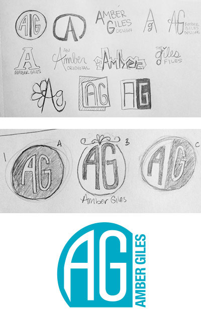
This project shows the progression of a logo I created for my personal use.
As I was designing a logo for myself I came up with several ideas, but the logo in the top left hand corner of the first photo I thought had the most potential. The original sketch doesn't quite work as the line in the middle could be mistaken for the letter I. So I continued to revise the shape and overall look of the logo. i did like the idea of keeping it as a circle because I like the clean shape. I also liked the idea of my initials being in a custom font, so I was able to draw the initials from one of my sketches.
As I continued to refine the shape of my logo, I removed the line between my initials and brought them closer together. I really liked the middle logo on the second round of revisions, but as I put it together and refined it further it wasn't working as well as I would have hoped. So I decided to go back to the look of the circle.
As I brought the sketches into Illustrator, I was able to refine the shape of the logo using both the shape of a circle and a square. I think it comes together realy well. It can work all as one unit, or just as an icon without my name. I chose the teal color because I thought it was a color that would stand out. Overall, I am very pleased with how my final logo came together.
